


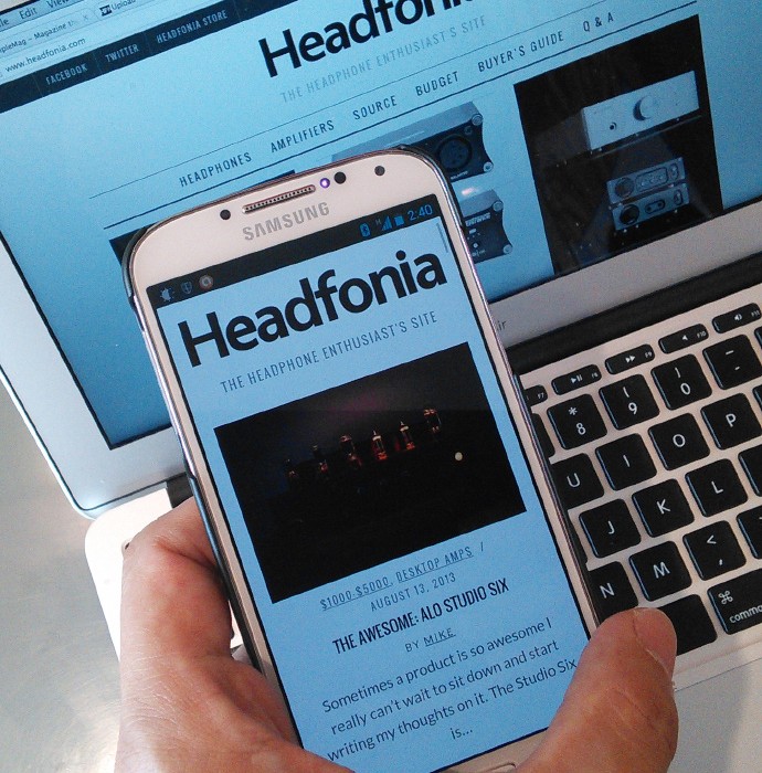
Time for a new look and to finally get Headfonia.com to support mobile devices more and more. I am so fortunate that we were able to get the change done without much hiccups. Many many thanks to Themesindep who created the SimpleMag theme we use for the new look. Not only does it look great but the back end configuration is also great.
We are still tuning the little things around the website but generally this is the look of the new site.

Darryn Harly Septalingga
new theme are nice, but honestly i’d prefer to the old ones because it looks so much cleaner 😀
well, it still looks beautiful and easier to navigate than the old ones… congrats for the new site mike 😀
L.
Thanks Darryn
Darryn Harly Septalingga
ah btw maybe you could remove recent comment section on the right side? since it already exist in footer section and it makes the website looks a little cramped. leave the right section only for the ads for cleaner looks…
just my two cents :p
dalethorn
The comments on the right are the only way I can see if a question I know has not been answered. There is no other way I found to get that information.
L.
I know right, I want that back om the home screen too.
dalethorn
But it would be good if we could scroll down a few days of comments instead of just a few that fit on the page.
Mike
Sorry dale, I don’t know how to make that happen. It would be nice indeed.
Mike
It would look cleaner but I think a lot of people would miss its functionality.
John123John
I would say that the new theme is still pretty clean looking, although alot less simple than the previous. Most blog-type (no offense, headfonia is so much more than that! its a way of life!) site are going to this sort of theme.
we are in the apple era~
Mike
Yea bigger font and all.
Mike
Thanks Darryn. The old one was my design but I thought it was getting old. 🙂
The selling point of this new theme is that it supports mobile devices which is a big deal. You’re on the headphone shop and need to make a decision, take out the smartphone and check the review here. 🙂
Albert Broman
To take it one step farther, concerning mobility, review the sound from LG G2 which boasts 24/192. Very interested in your views and opinions on this device as all the phone review sites seldom mention anything of significance when it comes to audio.
Mike
Well I tried playing some songs from my Galaxy S4 Google Edition and my old Nexus 4, and I thought the sound is better than the average iPod and perhaps the iPhones too since the iPhones don’t sound too different from iPods.
The sound is very clean, spacious, and with good dynamics though there are some artifacts in the midrange but well it’s a smartphone not an audiophile player.
L.
Have you noticed something wrong? Do you have tips for improvement? Let us know in the comments section.
To do list:
1. Picture Galleries
2. …
John123John
I kind of feel like everything is too big. like fonts, spaces between, pictures, titles, etc. Everything feels like it requires more scrolling. (specifically the space after the review and before the comments)
I think it would work out nicely if the comments section for the specific review were on the side, where the new comments are currently but I guess at the bottom is a little more normal.
I do like how, i think, the width of the comments are longer though.
4. If you are talking about on the front page, personally I prefer by date because that would make it easier for me to see everything at once but I can see how other may prefer by category. But you guys do have the drop down menu which should accommodate for that.
um, What are the idk maybe featured posts at the top of the homepage? That takes up a whole page before we get to see the reviews. Maybe featured or popular reviews could be on the side? like as links or something. I think you used to have that before on the very bottom.
the very bottom, grey. Lol honestly a few times when i was on that section, it thought I was on a different site or just didnt know where I was. Maybe somehow move the tags, which I use, up and to the side? basically cut that section in half. Honestly i dont feel like people will or want to scroll down that far.
Sorry if I sound too critical. I have no credentials, just opinions but great job on the new theme. Very very beautiful.
Mike
Thanks John for the input.
Yes the new theme is bigger in everything. I don’t know why but it seems that the direction of the web is going that way. I suspect that’s because more people are either:
1. Browsing on a mobile device.
2. Using a larger screen size (20″ monitor is pretty common these days).
Yes the wider width for comments do work out nicely.
4. Yes let’s go back to by date.
Which featured post at the top of the homepage? Are you talking about the ones on the menu pop up? They only show when you hover on the menu.
L.
4. We are mobile ready, critique of audio cables and tokyo festival are on top
John123John
yea those.
I think on the previous theme, you guys had most popular reviews which I thought was cool. Maybe most popular of the month or something.
also, am i reading this correctly? last headphone review was June 17th???
eeek! thought this was HEADfonia, not AMPfonia! 🙂
based on your comment, im expecting a lcd-3 review soon. Or maybe another HD650? jk jk
Mike
Yea I know about headphones the market is flooded with headphones and I just feel that I ought to be more selective on what to write about instead of becoming a library of all the headphones released in the market. That would get old really quick.
L.
I have 1 headphone review and 1 amp review as god as ready (pictures to do) Then another amp review and then a ciem. It’s not looking good for headphones 😀
dalethorn
I think you should do whatever your instinct says is most relevant. The only thing I would suggest not to do is if you detect that any suppliers are pushing you toward something that’s in their interest, but not something that advances Headfonia to its readers, then you just push back a little. But it’s the kind of world where they do supply the goods and we just consume them and report on them, so they have that advantage and you just have to walk between the raindrops (as the saying goes).
Mike
1. Picture galleries will have to be done manually so that’ll be the last thing I do.
2. Comments, let’s discuss.
3. See #2.
4. Was just experimenting with this but it seems that per date is still the better way to go?
L.
1. ok
2. + 3. Let’s listen to the readers
4. Great!
5. Important 😉
John123John
Whats the leaderboard? like most comments?
L.
it’s a banner
David Masson
Unfortunately not quad HD ready…
Mike
What resolution is that?
Do you have an example of a quad-ready site?
Thanks David.
David Masson
2650×1440 It is a common resolution for those “Korean” monitors. Same panel as in an Apple Cinema display. The only one that works very well with it off the top of my head is Wikipedia, believe it or not. The whole thing was mostly a joke, I just got the monitor, so I have been having some fun with my “first world problems.”
Mike
Okay, COMMENTS SECTION:
I can move the comments section back on the sidebar (so general layout will be like on the old site).
HOWEVER, that layout is looking a little boring after all these years whereas the new full-page-wdith layout looks very fresh as you get a tile-effect of the article blocks.
With the new full-page-width layout, it’s more bothersome to check the updated comments but if you do the reloads on the articles page you still get the comments on the sidebar. What do you think?
I can still make the change to the old layout, but I thought the new layout looks fresher.
L.
Well, we can use the emails we receive of the comments, but for the readers it might be more useful at the right hand of the screen. Whet do you think guys?
dalethorn
What would be best is keep the new layouts, and have a way to get comments on the sidebar, and better yet, be able to scroll back through at least a few days of comments on that sidebar. I can’t spend a lot of time looking at different pages trying to find comments.
John123John
So.. Im assuming we moved back to the old layout..
Functionally, its much better and looks are nice too.
A scroll or like load older comments or pages could be nice with the comments section but isnt totally necessary except for people like Dale (LOL sorry). I actually go through a bit of the comments as well but I am assuming they’re arent many like us. Maybe not.
wheres my search bar?!?! 🙂
Looks really good though. If the buyer’s guide gets updated, I will officially have no complaints! ^^ Very nice job, Mike and the rest of the Headfonia team!
John123John
wait.. found the search bar…
ohh.. pretty cool. little, i dunno, status bar.
says im logged in as Lieven? idk.
L.
sometimes that happens. You won’t have my admin rights though 😉
I haven’t found the search yet myself lol. where is it?!
John123John
Actually one more thing,
Since we do have the wider layout, would there be a way we could have more levels of comments? I think it currently maxes out at 3 and at that point, gets a bit confusing to read if you werent following along from the beginning
Mike
Sorry you have to be a Headfonia paying member to get more than three levels of comments.
Just kidding.
I have no control of that as DISQUS have total control over how they display the comments. Sorry.
Mike
Thanks John 🙂
Search bar is back. 🙂
George Lai
Interestingly enough, with this new website, the 27 pages at the bottom throw up a few articles which I’ve not read before. It’s like re-reading a favorite comic. Nice.