


Hadi told me the other day that we needed a new logo. So I started brainstorming.. this is the latest result of the brainstorming (credit to my wife for having the head on the logo).. nothing final yet, but just want to share it with you guys. 🙂
If you notice I have the facebook-look logo as well. No, we’re not going to use that one. 🙂

.Sup
I love the new logos! no.2 and no.3 are my favourites although no.3 would require changing the colour scheme once more, imo. Good stuff
Jose
I prefer the current one.
.Sup
maybe make one with capital H
Robert Lieu
lol facebook logo. I like the fifth one since the sketchy font matches the head doodle.
wsoelivan
I like the 4th one. B)
brandon
Make the e an ear?
Mike
Lol.. thanks for the comments guys.
I'll try to brainstorm a little more. 🙂
Cortes
sorry, but I dont like any of them ;-(
Mike, I think you should study the issue of the logo much more in detail. This kind of things are important for the visibility in internet. I can't help much, but I know that for instance names/images of animals are remembered more for people, so business with these kind of names have more chances of being remembered. You should browse at a bookstore a good bunch of books on marketing to make an sound decision.
Mike
Yea, thanks for the advice man. I know it's far from a mature logo. I guess there are a lot of homework left to do.
guest
I like the 5th..
Davy
I like the idea and it's a good start. I really enjoy your site and you share a lot of great reviews and lovely pictures with all of us audiophiles.
I thought that perhaps I could contribute a design for you and contribute back to your site. Here's a logo I put together for ya. Hope you like it 🙂
<img src="http://img24.imageshack.us/img24/2357/headfonialogo.jpg">
In case it doesn't embed, here is the direct link: http://img24.imageshack.us/img24/2357/headfonialo…
Mike
Shoot! that is really nice! Thanks, Davy! I like the illustration very much. Perhaps we can try with a full bold helvetica font and without the italic "f"?
Davy
Haha, awesome. Glad you like it! And, here ya go 🙂
<img src="http://img262.imageshack.us/img262/7462/headfonialogo2.png">
Mike
Dav, I looveee the face illustration. I've been trying to come up with a font that can pair well with the face, but haven't been so successful. Here's my best effort so far
<img src="http://www.headfonia.com/wp-content/uploads/2010/11/logobydavy_2.png">
Davy
Whoops! Sorry, the underline ran over the 'f'. It's fixed.
<img src="http://img442.imageshack.us/img442/2357/headfonialogo.jpg">
denging
i think the more 'iconic' thus a simple either logogram (logo) or logotype (typeface) would be perfect don't you think mike?
tingm
You've got a point there. But it's also hard to come up with a simple and yet iconic logo.
Davy
Ahh, I think I have something in mind. brb
Davy
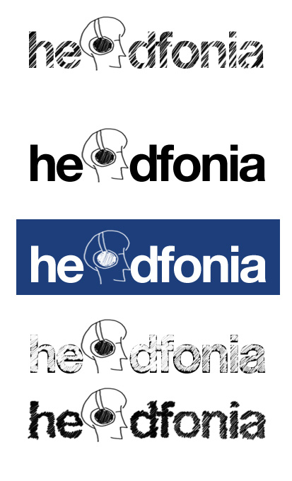
Alright, here's the original, but changed to all bw and the font adjusted slightly.
<img src="http://img23.imageshack.us/img23/4623/headfonialogo1bw.png">
Here is a completely new design, and a bit more iconic and graphic. This one probably has a bit more staying power.
Illustartion/logo:
<img src="http://img27.imageshack.us/img27/1066/illustrationver2.png">
Here are some complete logo variations. Color can be changed if needed.
<img src="http://img152.imageshack.us/img152/5002/headfonialogo2variation.png">
I personally like 3, 6, 7 the best 🙂
What do ya'll think?
Mike
You're really good at this stuff aren't you? Let me try to get a screengrab and put the logos there to see how it looks in a layout. 😉
Mike
Hi Dav,
I applied the logos in a screenshot, and I think having color is a plus over grayscale. I also prefer the original face drawing over the second version. What do you think?
<img src=http://www.headfonia.com/wp-content/uploads/2010/12/logo-applied-1.jpg>
<img src=http://www.headfonia.com/wp-content/uploads/2010/12/logo-applied-2.jpg>
<img src=http://www.headfonia.com/wp-content/uploads/2010/12/logo-applied-3.jpg>
denging
i would say that there is an opportunity to us to play little bit on letter 'ea' or 'd' to say 'headphone related' (as the BIG IDEA) rather than point it out too literally ('too on the nose') with pictures/cartoon… don't you think guys?
Mike
I see what you're saying. Perhaps you can put that idea into a sketch? 🙂
Jose
Great designs davy! I personally like the one with the italic F (fixed one). I just realised, the LCD makes a perfect D, but that may be to tacky.
Jose
Also, the font in the greyscale one is good, maybe use the same font design without the greyscale.
@JotaIGz
Jose here. How do I post an image?
Mike
<img src=http://www.headfonia.com/wp-content/uploads/2010/12/img_src_01.jpg>
@JotaIGz
/Users/jigf69/Desktop/Screen shot 2010-12-02 at 12.02.14=http:// =http://www.imageURL.com/
@JotaIGz
mmm, I am so bad at internet stuff
Mike
send it to me through email. 🙂
Mike
This is from Jose:
<img src=http://www.headfonia.com/wp-content/uploads/2010/12/logo_by_jose_1.jpg>
Davy
Thanks for the comments, guys 🙂
Some additional variations with the bold outline in b/w and color illustration. B)
<img src="http://img607.imageshack.us/img607/3360/headfonialogover1variat.png">
And a few others I liked.
<img src="http://img821.imageshack.us/img821/659/headfonialogover1variate.png">
Davy
Page samples
<img src="http://img97.imageshack.us/img97/5431/websamples.jpg">
Mike
Dave,
I think you're getting there, man. 😀
Mike
Been looking at these last four variations, and I think the third one looks best. I especially like the black/white color. The fact that the white coloring starts on the letter "f" makes it easier for people to remember that the website is spelled HeadFonia, not HeadPhonia.
Mike
Denging sent me an email explaining his thoughts..
His approach starts with the idea that Headfonia as a website adds our own perspective on the audio gears. He also believes that a logotype (a logo purely based on type/font) has more strength and is more memorable over long periods of time. Some examples include: Coca Cola, McD, Dell, Lenovo, also Yahoo, Google, facebook, and so on.
I think he has a point, but of course the difficulty is how to come up with a good looking logotype. And, on the other hand, I also like Dave's illustrations.
Anyway, here is the logo that Denging sketched up.
<img src=http://www.headfonia.com/wp-content/uploads/2010/12/logo_by_denging_1.png>
glac1er
I personally think fonts and drawings are not mutually exclusive, but I do think it's best if the fonts are more memorable than the picture that goes with it, so people can actually remember the name of the company.
A lot of company logos has variations that goes with a drawing, like the Coke bottle's silhouette. Remember Starbucks, NBA logo, Target, Kentucky Fried Chicken, Nike, Quaker Oats, Michelin, Puma, Rolex ? McD golden arches is also a font-drawing hybrid. Very clever I have to say, though its creator must be thinking that I'm over-analyzing it :D.
Matt
doesn't look professional at all.
Mike
I know. Thanks Matt
Matt
Hi Mike,
I was playing with some logo ideas and sent you what I think would look good, but you know everybody has different taste, it is so difficult to please everybody. I think your website is truly professional looking and the photography is top notch. (superb) You just need a nice modern simple logo that is easy to read even when it is small and scaled down.
Here are 4 variations I made for you tonight, (couldn’t sleep 🙂
Let me know if you want me to make some more and new ideas. More eyes see more…
Matt
http://www.mayer-graphics.com/headfonia_logo4.jpg
http://www.mayer-graphics.com/headfonia_logo3.jpg
http://www.mayer-graphics.com/headfonia_logo2.jpg
http://www.mayer-graphics.com/headfonia_logo1.jpg
Mike
I think Dave's is much better, but I can't seem to make his style of illustration blend with the overall design scheme of the page.
Mike
Matt,I tried replying to your email but it got bounced.
Matt
Hi Mike,
Can you try my other email please? [email protected]
That works 100%. Comcast has a weird spam system and filters out many safe emails also.
Thanks a lot,
Matt
Mike
Email re-sent.Thanks, Matt
Matt
Thank you! Received it and replied back to you already.
Thanks,
Matt
Mike
Just playing around with 3D as-per Denging's suggestion:
<img src=http://www.headfonia.com/wp-content/uploads/2010/12/logo_by_mike_3d_1.png>
davy
Hmmm, I think a 2d graphic look and feel will probably fit your site a little better. Keeping it simple, yet clean and modern (not overly done). Your website has a mature, smart and modern feel to it. Especially with the excellent photography…you truly have a talent for that. I love your work in that regards (the reviews are great too..hehe).
Here are a couple samples of what I have in mind.
<img src="http://img16.imageshack.us/img16/7312/johnniewalkerandboxeelo.jpg">
I'll see what else I can put together for ya. I have a lot of ideas.
Mike
Davy, can we talk on the phone?
You can send me the phone number through this form http://www.headfonia.com/contact-us/ 🙂
davy
Hmmm, I think a 2d graphic look and feel will probably fit your site a little better. Keeping it simple, yet clean and modern (not overly done). Your website has a mature, smart and modern feel to it. Especially with the excellent photography…you truly have a talent for that. I love your work in that regards (the reviews are great too..hehe).
No problemo. It has been done 🙂
glac1er
I love your drawings, Davy. And it keeps getting better 😀
I will vote for the second one on the black/white and also the all-black third one with gradient looks cool.
@JotaIGz
Very nice davy. I like more a combination between the more saturated face and the fonts on the 3rd one with a little more space between the letters.
@JotaIGz
By the 3rd one I mean in the black/white set.
@JotaIGz
Hmmm, on a second view the "A" on the 3rd is not right. The 1st one is better.
Mike
This batch is definitely closer to a final logo.
davy
Thanks Mike and JotaIGz for the comments. I'll tweak the changes to the 1st logo and add the saturated illustration to it. Good eye on catching that. I didn't think anyone would notice 🙂
davy
Mike, did you get my number?
Mike
I did not get your number, but I've sent you an email.
Pavel
Your web site (good) deserves a good logo. Hire professional design firm or designer.
@JotaIGz
I think he won't need that service as some of his readers are already making a great effort in helping with the logo.
Mike
Thanks, Pavel. I've considered doing that too, but I think I'm liking Davy's design more and more. 🙂
Windsor
I'm in the process of designing a new logo myself. If you feel it right to do so, there's a book called 'Logo Design Love,' by David Airey that's worth a look.
P.S. This website has some truly great content.
Mike
Thanks, Windsor. 🙂
@JotaIGz
Any news on the logo?
Mike
Me and Dave are discussing this directly through email. I think we don't want to rush things, so we can end up with something that can last a long time. Thanks for asking, though. 🙂
Brian S.
Dudes, I am new to the site but I am an avid AV guy. I am getting lost in the design – it almost looks like California on the end. I like the first design with the guy "within" the text. This provide separation. The final design with the chiseled-chinned man looks quite a big smug – it reminds me of the singer for A-ha. I vote for the first design. The 3D stuff is also very 1980's. Good job, guys.
Mike
Thanks for the comments, Brian. We're still working on the design, and we're still not sure on what the final one will be like. Your comments are very appreciated.
Matt
Hi Mike,
Here are my logo ideas for your site, let me know what you think:
http://www.mayer-graphics.com/headfonia_logo4.jpg
http://www.mayer-graphics.com/headfonia_logo3.jpg
http://www.mayer-graphics.com/headfonia_logo2.jpg
http://www.mayer-graphics.com/headfonia_logo1.jpg
maj
hi mike,
just my two cents : what if the man with HP is placed on the letter ‘o’ in the word headfonia?
great site – awesome review
Anonymous
Hi Maj,
Thanks for the input. I’ve stopped developing a logo for now. 🙂